Difference between revisions of "Token Features"
From Roll20 Wiki
Andreas J. (Talk | contribs) m (→See Also) |
|||
| Line 1: | Line 1: | ||
<div style="background:#f0e2a1; border: 3px solid #dbc870; padding: 10px;"> | <div style="background:#f0e2a1; border: 3px solid #dbc870; padding: 10px;"> | ||
<big>'''''Attention:''''' | <big>'''''Attention:''''' | ||
| − | ''Roll20 is no longer maintaining this document on the community wiki. For the most up-to-date information please visit this page on our | + | ''Roll20 is no longer maintaining this document on the community wiki. For the most up-to-date information please visit this page on our help center for assistance: [https://roll20.zendesk.com/hc/en-us/articles/360039674573-Token-Features Here].''</big> |
</div> | </div> | ||
{{Ambox | {{Ambox | ||
Revision as of 18:45, 15 May 2020
Attention: Roll20 is no longer maintaining this document on the community wiki. For the most up-to-date information please visit this page on our help center for assistance: Here.
| This page could do with some cleanup. The UDL section is only an image + a link to the main UDL page. |
Contents |
Creating a New Token
Any image that is placed on the b Objects and Tokens or E GM Info Overlay Layer automatically becomes a Token object. You can always scale the pawn field and its image to scale by right-clicking, advancing, assigning dimensions; if you use a grid that can influence other methods of varying the dimensions of the image and avoid inconvenience. You can rotate the image using the outgrowth that designates the front of the counter from above and the top in portrait use, but several token-specific elements have also been added. Note that generally the image requires a horizontal and then a vertical reversal to respect the direction provided in the programming of Roll20. Note that all of these instructions also apply to Rollable Table Tokens(aka. Multi-sided tokens).
Token Features
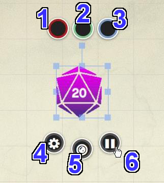
Radial Menu Bubbles (1)
These three input bubbles can be used by the players or the GM as a counter to keep track of health, turns, money, fuel or whatever else proves useful for your game. Click on a bubble to change the value. You can enter a new value (e.g. "20" or "ABC"), and for numerical values you can also enter relative values (e.g. "+5" will add 5 to the current value, or "-10" will subtract 10.) You can change the colored rims of the bubbles by going to "Token Bar Colors + Display Settings" section on the My Settings tab on the Sidebar and selecting different palette colors.
Bar Overlay (2)
If set to be visible, these are passive bars that fill or empty depending on what's entered in its corresponding colored Value Bubble.
Nameplate (3)
If set to be visible, this will display the name of the Token.
Edit (4)
Full section: Token Settings
Clicking on the 'Edit/Settings button brings up a new window where you can name the Token, set permissions on who can control the Token, set what bars/auras are visible to/editable by the players and keep storage of GM notes. Note: This button is only visible to the GM You can also double-click on the token to open the same settings dialog.
Token Markers (5)
Main Article: Token Markers
This button rolls out a menu that gives you a series of colored dots, a red X and over 40 different markers that overlay over the Token image. You can use these to show status, ailments, or to differentiate multiples of the same Token type. You can have multiple Token Markers displaying simultaneously.You can also add a numeral to individual Token Markers by mousing over the desired Token Marker in the rollout menu and tapping "0" through to "9" on the keyboard or numpad. A red numeral will appear on the Token Marker. Tapping "0" will clear the numeral from the Token Marker (but the Token Marker remains until it is clicked again in the menu).
The default position for the Token Markers is across the top of the token, but you can choose to have them run along the bottom, right or left side by going to the "Token Bar Colors + Display Settings" section on the y My Settings tab on the Sidebar and selecting the layout from the "Marker Position:" drop-down menu.
You can also add Custom Token Markers, which will appear in this menu as well.
Animation Pause (6)
On animated tokens, click the pause/play button to start or stop the animation. Note that animations will not start on the VTT if the "Enable Animated Graphics" checkbox is disabled in the y My Settings tab.
Token Actions
Main Article: Token Actions
Token Actions are specially-designated macros and character abilities which appear whenever a token is selected on the screen. They appear in a bar along the top of your screen, and the contents of the bar are context-sensitive.
Token Settings
Token Settings are split into Basic, Advanced and Updated Dynamic Lighting-tabs, that you can seamlessly switch between while editing your token information. All changes update in real-time.
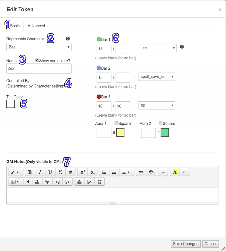
Clicking the Edit button or double clicking on a Token brings up the Edit Token window:
Basic tab
Represents Character (2)
Tokens that represent a Character use the Can Be Edited & Controlled By settings of that Character.
Setting a Token to represent a Character allows Character Attributes to Token Bars (see the Useful Tip below).
If a Token represents a Character, you can open that Character to its Bio & Info Tab by holding down Shift and double-clicking on that Token or by holding down Shift and single-clicking on its Token Settings icon. Holding down Alt instead of Shift will open that Character to its Attributes & Abilities Tab.
| Useful Tip: Set up Characters in the N Journal to represent each of your PCs. Then choose a Token for each Character. Place the Tokens across all the pages of your game, and use the Represents Character setting to link each Token to the appropriate Character. Then when your players update their Tokens or their Character, all the Tokens across every page will always stay up-to-date. See Also: Linking Tokens to Journals |
Name (3)
Here you can set the name of the Token. If you choose to use the t Turn Tracker in your game, the Token's name will appear next to its thumbnail picture in the turn list.
Controlled By (4)
This is where you assign who in your game has permission to control the Token. If the Token represents None/Generic then clicking on the "Controlled By" field will bring up a list of all the players in the current game as well as being able to select the option "All Players". You can assign multiple players to a single Token. If the Token represents a specific Character, then the Token is controlled the player that has control of the Character which is set in the N Journal. GM always has control over the Tokens in their Game.
Note: If you are creating a brand new Game and your players have yet to join, their names will not yet be available for Token assignment. If you're setting your Pages up in advance of your first gaming session, it's recommended to set your PC Tokens to "All Players" and later fine-tune the permissions when your players have visited your Game.
Tint Color (5)
Here you can add a color filter to the Token. The default tint color is transparent.
Bars and Auras (6)
Bars
This is where you can set whether any of the three bar elements are either visible and/or editable to the players. The green heart, blue bolt and red cardiograph icons for the bars are there for identifying purposes only. They do not have to represent anything in particular in your game.
You can also input numerical values for the Bar Bubbles directly from the Edit Token window. There are two input fields available for each Bar. The first field is for the Bar's current value and is what's featured in the Token's corresponding Bar Value Bubble. The second field is for the Bar's total value. If it's supplied, Roll20 will use the comparison between the two numbers to render how full or empty that corresponding Bar appears on the Tabletop. The fill will reflect whatever the Player plugs into their Bar Value Bubble while in-game.
Also note that if the Token Represents a Character (as chosen in the field above), you can choose to link each bar to a specific Character Attribute. If you change the value in the bar (via the Token settings, radial bubbles, or in the Character settings) the value will update automatically.
Auras
An Aura is a translucently filled circle or square that radiates from the center of a Token. You can have up to two Auras active at once on any given Token. To turn one on, make sure it's toggled on to See first and then enter a radius value for the Aura. Next to the Aura's radius input field is a palette button where you can choose the color for the Aura. You can set the Aura to a square instead of a circle by checking off the "Square" checkbox next to the color palette button.
Note: To completely remove an Aura from view, do not change the radius value to zero. Clear the field instead. At zero, the Aura still draws to encircle the outer edge of the Token.
GM Notes (7)
This is a field where a GM can keep private notes on any given Token.
Advanced Tab
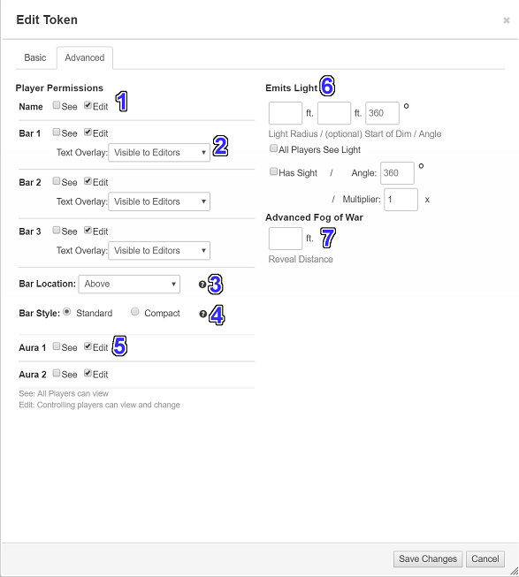
Player Permissions (1)
There are possible permissions for each setting: See or Edit. You can toggle the flag for each type by checking or unchecking the corresponding box.
Setting the See flag will allow all players in the game to view the current value of the bar, or see the aura drawn on the tabletop, regardless of whether or not they can control the Token.
Setting the Edit flag will allow all players who can control the Token (based on the "Controlled By" field, above) to see and edit the values of the bar, or change the radius of the aura drawn on the tabletop.
So if you have a Token that you want all players to see the bars for (like a PC), set the See flag. If you also want to allow some players to keep track of their own health, set the Edit flag. If you only want players who can control the Token to see and edit the bars, set only the Edit flag. And of course if you set none of the flags then only the GM will be able to see or edit the bars and auras.
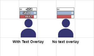
Text Overlay (2)
Token bars can display text with the current value and maximum value of the bar.
As before, you can set the values of the bars to have a current and max value, or to pull those values from a character sheet. You can set the current value to more than the maximum, and you can set the current value to a negative value. When you do this, a "+" or "-" icon will display in the bar.
You can also include information in parentheses or text, and can include decimal points.
The current and max values for your bars will display as text on the bar
In the Advanced tab on the Edit Token options, you can select a value for the Text Overlay:
- Hidden: Nobody sees it, including you.
- Visible to Editors: Only players who can control the token (and GMs) see the text.
- Visible to Everyone: All players can see the text overlay.
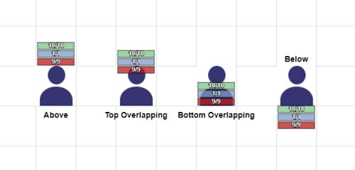
Bar Location (3)
The token bar placement is configurable on a token-by-token basis. In the Bar Position, you can select Above, Top Overlapping, Bottom Overlapping, and Below for the token bar position.
You can change the location of the token markers for your game if they're in the way of the token bars in the y My Settings tab.
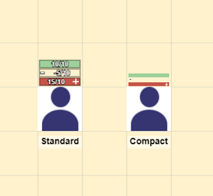
Bar Style (4)
Token bars have two options: standard and compact.
The Standard option displays the bars stacked on top of each other, with the text overlay, if any, and the +/- overflow icons.
The Compact option displays the bars stacked on top of each other, but very narrow, with no overlay or overflow icons. When this option is selected, the text overlay will always be set to "Hidden" and cannot be changed.
Emits Light (6)
| This is about a Roll20 feature exclusive to Plus & Pro-subscribers, or to players in a Game created by a Plus/Pro-subscriber. If you'd like to use this feature, consider upgrading your account. |
Here you can set how far light emits from the Token and if All Players can see the light emitted when Dynamic Lighting is enabled. This option allows you to enter a light radius amount and gives you a checkbox for All Players See Light. When the checkbox is left unchecked, the only player(s) who can see that token’s light emission are those who have assigned permission to that token. In addition to emitting light, you can now customize the “angle” of lights and the line of sight of tokens. So you can specify, for example, that a player should only have a 140-degree field of view instead of 360-degrees. The Multiplier feature allows you to adjust how effectively a token sees light. At a value of 1 the token sees light normally but at a value of 2 the token sees twice as far with the same light source.
Has Sight (7)
Tokens that have sight and are assigned to a player or GM will always be displayed to the player that controls the token, even if Fog of War or Advanced Fog of War would normally obscure them.
These tokens will also appear in front of other tokens on the tabletop to the controlling player.
Advanced Fog of War (8)
| This is about a Roll20 feature exclusive to Pro-subscribers (and often to players in a Game created by a Pro-subscriber). If you'd like to use this feature, consider upgrading your account. |
The Advanced Fog of War Reveal Distance sets how far your token will have Advanced Fog of War revealed to it. If the token does not have a light source, the greyed-out map will be revealed. If it does have a light source, it will see the lit-up map that is illuminated. Note that a token must have sight in order to see anything or have Advanced Fog of War revealed.
For performance reasons, tokens that are not owned by anyone do not reveal Advanced Fog of War. GMs can change this option in the Advanced Fog of War for an individual page.
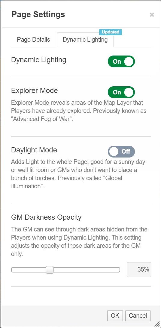
Updated Dynamic Lighting
Main Page: Updated Dynamic Lighting
See Also
- Linking Tokens to Journals
- Token Actions
- Multi-Sided Tokens
- y My Settings-tab
- Token Z-Ordering — How tokens layer on the VTT
- Token Markers - How to add custom token markers to your game


