Difference between revisions of "Image Best Practices for Roll20"
From Roll20 Wiki
Kristin C. (Talk | contribs) (Formating Fixes) |
Kristin C. (Talk | contribs) m |
||
| Line 27: | Line 27: | ||
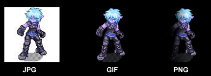
[[Image:File_Type_ex.jpg|frame|center|1px|Transparency with JPG, GIF, and PNG Files]] | [[Image:File_Type_ex.jpg|frame|center|1px|Transparency with JPG, GIF, and PNG Files]] | ||
| − | + | {{mbox | text = If you need a large translucent map overlay: First, try to dial down the image resolution as low as possible and then try to uniformly scale the image dimensions to a size smaller than you actually need and enlarge it when it’s uploaded in Roll20.}} | |
== Working with Screen Space == | == Working with Screen Space == | ||
Revision as of 17:24, 1 July 2013
This is a rundown of several image practices that’ll ensure the optimal playing experience. Following this guideline should cut down on image lag, make it easier to use images on the tabletop, and should ensure that your images are clear and readable.
Contents |
Web-Friendly vs. Print Images
If you’re playing from a commercial adventure pack, there’s a high chance you’re working from a PDF file which is often published with the intended purpose of being printed out later by the user. In order for graphics to be readable and crisp for print, the image resolution - the DPI (Dots per inch) has to be kept rather high. The standard minimum resolution for a printed image is roughly 300 DPI. The higher the DPI, the larger the image’s file size is and the harder a processor has to work to display the image. The graphics contained within a PDF such as maps, character portraits and handouts aren’t designed for web, they’re designed for print. We recommend that they shouldn’t be dragged directly from a PDF file and into a Roll20 Campaign.
Image resolution is meaningless to how an image displays on the screen. The deciding factor of how an image displays on screen is determined by the dimensions of the image. A 500 pixel high by 300 pixel wide image will display on screen as 500 pixels by 300 pixels regardless if it’s 75 DPI, 200 DPI, 600 DPI and so on. When you’re working with images over the internet, the higher the DPI means there’s more needless data that needs to be transferred which will slow your campaign down.
If you want images to run smoothly in Roll20, keep image resolution low. The standard for web has been 72/75 DPI since the dawn of graphical web sites. Anywhere between the 70-150 DPI range should be adequate for your campaign images.
File Types
The three available image file types that can be imported and used in Roll20 are JPG, GIF and PNG. Below is a chart comparing the file formats against each other:
| File Type | Transparency Availability | Translucency Availability | File Size | File Type Pros | File Type Cons |
| JPG | No | No | Average | Smooth gradients, small file size | No transparency options, quality can suffer when heavily compressed |
| GIF | Yes | No | Smallest | Palette swatch control, great for pixel art | Poor quality with gradients, not advised for realistic images |
| PNG | Yes | Yes | Largest | Lossless compression - high quality images | File size inflates when using extensive alpha channel work |
If you have graphics that don’t require any transparency or translucency, stick with JPG files. The GIF file type is handy if you want just a simple aliased cutout image for token objects. PNGs, because of their file size, should be used exclusively for when you have images that require degrees of translucency or smooth anti-aliased edges on an image cutout.
| If you need a large translucent map overlay: First, try to dial down the image resolution as low as possible and then try to uniformly scale the image dimensions to a size smaller than you actually need and enlarge it when it’s uploaded in Roll20. |
Working with Screen Space
When a GM hands out documents to their players around a physical table, often the item is written or printed on portrait-oriented paper. On a tablet, a person can simply flip the screen whether a graphic is either Portrait or Landscape. This can’t really be done on a computer monitor. When you want to create handouts or splash screens for use in Roll20, keep in mind that the average user often is working on a widescreen monitor with fixed screen resolution (not to be confused with image resolution). You want to create and plan out handouts and splash screens that’ll fit nicely on the collective user’s screen. Instead of thinking portrait, go with landscape orientation for notes, letters, and pictures or anything else that isn’t going to be a tabletop map.
Regarding screen resolution, get an idea of what your players are using. Are they working at desktop stations? Tablets? Laptops? Find a happy medium of screen resolution and work your graphic sizing around that, so no one will have to play with their zoom settings so they can view your images. Websites like w3schools.com keep yearly tallies of the average screen resolution over the years if you need a generic design guide.
Roll20 Image Dimensions
Here’s specific Roll20 dimensions for certain graphic elements.
| UI Element | Pixel Width | Pixel Height |
| Grid Square | 70px | 70px |
| Hex Unit (Vertical)* | ~75px | ~88px |
| Hex Unit (Horizontal)* | ~94px | ~81px |
| Max Character Portrait Size | 250px | No Height Constraint |
| Campaign Details Icon | 300px | 512px |
* The hex grid is mathematically drawn, so the pixel height and width for a single hex unit is an approximation
Token Images
Token images, due to their small size, are probably best suited for PNG formats (if you want transparency) for best quality. If you’re not relying on a square or hex grid to move tokens about the tabletop, you don’t need to concern yourself about the actual dimensions of the image. If you /are/ using a grid; however, you’ll want to make sure the image dimensions are made square. The reason for doing this is that an image when dropped onto a gridded tabletop will warp the dimensions of the image to best sit inside a single grid unit. This process might dramatically change the proportions of your image. If you plan to create token images for a gridded tabletop, add padding around your token image so that the dimensions are square.
This padding is even more important if you’re creating a token that’s an oblong creature that is expected to span over multiple grid units (Like a war horse that’s suppose to span 1 x 2 grid units). Rotating an oblong token will snap in undesired locations. You can avoid snapping by rotating and moving while holding down the ALT key or you can avoid the snap issues entirely by just adding padding to the image to keep it square.
Troubleshooting Image Problems
Common Problem:
“Why does is it taking Roll20 forever to zoom or pan across a map?”
“When I try to zoom in past 100%, my map just disappears.”
“Images are taking forever to appear for some or all of my players.”
Solution:
This is normally due to file size of any given image in a campaign. Check the file size of the images you’re using for your campaign. If any image is over a megabyte in size, we’d recommend checking its image resolution and decrease it in an image editing software package. Also, make sure you’re using the right file type to minimize file size.
Common Problem:
“My players are having a hard time reading my hand written note, why does the preview look so small?”
Solution:
Keep in mind that the limits of a player’s screen when you’re creating handouts. Try to make as much use of the available screen space. This normally means designing items that are wider than they are tall to best fit on a widescreen monitor.
Common Problem:
“When I dropped my token art onto the table, the dimensions of the image got really messed up.”
“I have this image of a horse, wolf, dog, etc. that I’m using for a token. I’m getting all sorts of rotation and movement problems while using the token on a grid.”
Solution:
Sounds like your image you’re using for your token isn't square to begin with. Make sure you add padding around your Token graphics so that they’re square. This will ensure that your image’s proportions are retained and you’ll be able to rotate and move them as expected on a grid.


