Difference between revisions of "Creating Marketplace Assets"
From Roll20 Wiki
Andreas J. (Talk | contribs) m (fix partner help center link) |
|||
| (3 intermediate revisions by one user not shown) | |||
| Line 1: | Line 1: | ||
| − | + | {{revdate}}{{HCbox| {{Marketplace Partner}} }} | |
| − | + | ||
| − | + | ||
| − | + | ||
| − | |||
| − | {{mbox | text = '''Note:''' Looking for more image practices to ensure the optimal playing experience? Review our [ | + | '''See {{Marketplace Partner}} for official documentation.''' |
| + | |||
| + | When creating assets for the Roll20 [[Marketplace]], there are certain guidelines that you should follow in order to provide the best experience for the end-user. While you are free to create your assets using different specifications than those listed here, keep in mind that doing so can lead to degraded performance (and unhappy customers). If you have any questions about creating Marketplace assets, please don't hesitate to {{bug}}. | ||
| + | |||
| + | {{mbox | text = '''Note:''' Looking for more image practices to ensure the optimal playing experience? Review our [[Image_Best_Practices_for_Roll20|'''Image Best Practices for Roll20''']] wiki to learn how to cut down on image lag, make it easier to use images on the tabletop, and ensure that your images are clear and readable.}} | ||
| Line 21: | Line 21: | ||
The other consideration to ponder is the size of the image (labeled "Dimensions" in the screenshot above), and the image format to use. Here are our recommendations for each: | The other consideration to ponder is the size of the image (labeled "Dimensions" in the screenshot above), and the image format to use. Here are our recommendations for each: | ||
| − | * '''Tokens''': 280x280 pixels per "square" in PNG format, regardless of the "in-game" size of the token. At this image size, the token could be as large as 4x4 squares in-game without any issues, and will support zooming in -- and it will look good on the Marketplace listings page, as well. Do be sure, however, that your tokens are still recognizable/"look good" at smaller sizes (e.g. 70x70 pixels). Note that tokens should "fill" the square without any excess padding, and feature a drop-shadow or other outline to make them easy to distinguish from background elements. For a great example of this in practice, see [https://marketplace.roll20.net/browse/set/61/max-attack-3-monsters-iii]. | + | * '''Tokens''': 280x280 pixels per "square" in PNG format, regardless of the "in-game" size of the token. At this image size, the token could be as large as 4x4 squares in-game without any issues, and will support zooming in -- and it will look good on the Marketplace listings page, as well. Do be sure, however, that your tokens are still recognizable/"look good" at smaller sizes (e.g. 70x70 pixels). Note that tokens should "fill" the square without any excess padding, and feature a drop-shadow or other outline to make them easy to distinguish from background elements. For a great example of this in practice, see [https://marketplace.roll20.net/browse/set/61/max-attack-3-monsters-iii Max Attack 3 - Monsters III]. |
* '''Maps''': 140x140 pixels per "square" in JPG format. So if the map is intended to be a 20 square x 20 square room, the map image should be 2800x2800 pixels. If your map is going to be larger than 30x30 squares (4200x4200 pixels), you may want to consider offering one "full" map, and then several different "sub-maps" that can be pieced together in the app to make the full map -- this can improve performance for the end-user. In addition note the file size restrictions below. | * '''Maps''': 140x140 pixels per "square" in JPG format. So if the map is intended to be a 20 square x 20 square room, the map image should be 2800x2800 pixels. If your map is going to be larger than 30x30 squares (4200x4200 pixels), you may want to consider offering one "full" map, and then several different "sub-maps" that can be pieced together in the app to make the full map -- this can improve performance for the end-user. In addition note the file size restrictions below. | ||
| Line 41: | Line 41: | ||
Once you've created your assets, we strongly recommend that you take the time to upload them to Roll20 yourself, and play around with them in-game. How do they look at different zoom levels? For maps and map tiles, how do tokens look placed on top of them? How hard is the map/tile to line up to the grid? Taking the extra time to do this testing will not only help you create better assets, it will help you avoid many common pitfalls such as creating tokens that look good at large resolutions but are unusable in-game. | Once you've created your assets, we strongly recommend that you take the time to upload them to Roll20 yourself, and play around with them in-game. How do they look at different zoom levels? For maps and map tiles, how do tokens look placed on top of them? How hard is the map/tile to line up to the grid? Taking the extra time to do this testing will not only help you create better assets, it will help you avoid many common pitfalls such as creating tokens that look good at large resolutions but are unusable in-game. | ||
| − | Finally, | + | Finally, {{bug}} with your finalized assets for further instructions on how to upload them to the Marketplace. We'll also want you to create a "banner" for your set, which is 512x512 pixels and is used as the set's "advertisement" on the site. |
| − | + | [[Category:Marketplace Development]] | |
| − | [[Category:Marketplace]] | + | |
Latest revision as of 09:36, 23 April 2023
Page Updated: 2023-04-23 |
Attention: This page is community-maintained. For the official Roll20 version of this article, see the Help Center for assistance: Marketplace Partner Help Center .
See Marketplace Partner Help Center for official documentation.
When creating assets for the Roll20 Marketplace, there are certain guidelines that you should follow in order to provide the best experience for the end-user. While you are free to create your assets using different specifications than those listed here, keep in mind that doing so can lead to degraded performance (and unhappy customers). If you have any questions about creating Marketplace assets, please don't hesitate to Contact Roll20.
| Note: Looking for more image practices to ensure the optimal playing experience? Review our Image Best Practices for Roll20 wiki to learn how to cut down on image lag, make it easier to use images on the tabletop, and ensure that your images are clear and readable. |
Contents |
[edit] DPI: Image "Density"
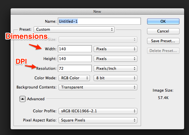
The first thing to tackle is making sure that you are working with the proper image density setting. This is a setting that is different than the dimensions of the image. For Roll20 assets, it should always be set to 72 DPI (also known as "72 Pixels/Inch"). In Photoshop, you can access this setting while creating a new image:
You can also access the same setting for an existing image under the "Image => Image Size" menu in the application menu.
[edit] Dimensions
The other consideration to ponder is the size of the image (labeled "Dimensions" in the screenshot above), and the image format to use. Here are our recommendations for each:
- Tokens: 280x280 pixels per "square" in PNG format, regardless of the "in-game" size of the token. At this image size, the token could be as large as 4x4 squares in-game without any issues, and will support zooming in -- and it will look good on the Marketplace listings page, as well. Do be sure, however, that your tokens are still recognizable/"look good" at smaller sizes (e.g. 70x70 pixels). Note that tokens should "fill" the square without any excess padding, and feature a drop-shadow or other outline to make them easy to distinguish from background elements. For a great example of this in practice, see Max Attack 3 - Monsters III.
- Maps: 140x140 pixels per "square" in JPG format. So if the map is intended to be a 20 square x 20 square room, the map image should be 2800x2800 pixels. If your map is going to be larger than 30x30 squares (4200x4200 pixels), you may want to consider offering one "full" map, and then several different "sub-maps" that can be pieced together in the app to make the full map -- this can improve performance for the end-user. In addition note the file size restrictions below.
- Map Tiles: 140x140 pixels per "square" in JPG format, unless it is an "object" such as furniture or decorations that will sit on top of other tiles, in which case use PNG. Only use PNG when necessary -- it places a much heavier burden on the processing of the end-user's system than JPG. For multi-square (or "room") tiles, you will want to experiment to make sure that any grid lines line up once placed in Roll20. If each of your tiles is only one "square" in-game, then you don't need to worry about this. Note: Map tiles are the hardest assets to create correctly, so for your first set you may want to try and create tokens or full-scale maps.
[edit] File size
The maximum size of any image on Roll20 is 10MB. Note that some computer systems measure a "MB" differently than others, so if you approach the actual limit your uploads may not work. Give yourself some headroom to be safe. You should only get anywhere close to this limit on maps (tiles and tokens are likely to be much smaller). If you do hit the limit:
1) Be sure you are using JPG wherever possible, as it will result in much smaller file sizes. PNG should ONLY be used when absolutely necessary, and there aren't many cases where a PNG map is necessary.
2) Split the map into smaller maps that can be joined together in Roll20 by the end user.
Keep in mind that while 10 MB is the hard limit, most assets in the Roll20 Marketplace are less than 5 MB. If you are going above 5 MB with your assets, you may want to consider what you are building, and if it's possible to lower the file size. Higher file sizes, like higher resolutions, tend to slow down user's computers.
[edit] Putting It All Together
Once you've created your assets, we strongly recommend that you take the time to upload them to Roll20 yourself, and play around with them in-game. How do they look at different zoom levels? For maps and map tiles, how do tokens look placed on top of them? How hard is the map/tile to line up to the grid? Taking the extra time to do this testing will not only help you create better assets, it will help you avoid many common pitfalls such as creating tokens that look good at large resolutions but are unusable in-game.
Finally, Contact Roll20 with your finalized assets for further instructions on how to upload them to the Marketplace. We'll also want you to create a "banner" for your set, which is 512x512 pixels and is used as the set's "advertisement" on the site.


