Difference between revisions of "Mapping with Gimp"
From Roll20 Wiki
m |
Andreas J. (Talk | contribs) m |
||
| (3 intermediate revisions by one user not shown) | |||
| Line 1: | Line 1: | ||
| + | {{revdate}} | ||
==Creating a Map using Gimp== | ==Creating a Map using Gimp== | ||
| − | This tutorial was created using Gimp 2.6, but should still be useful with later versions of the software. | + | {{cleanup-msg|This tutorial was created using Gimp 2.6 (in 2014), but should still be useful with later versions of the software.|2019}} |
| + | This tutorial will focus on creating interior style maps and especially the classic dungeon. However, the techniques can be used to create any interior-style map. | ||
# Create new canvas with the appropriate dimensions. Create new canvas by going to File->New… [[File:Img01.png|thumbnail|center]] | # Create new canvas with the appropriate dimensions. Create new canvas by going to File->New… [[File:Img01.png|thumbnail|center]] | ||
| Line 8: | Line 10: | ||
# We want to lay the cover for the floor, so we will add a new layer called “Floor.” To do this, In the Layers dock, click the new Layer button and in the New Layer dialog box, make sure it has the same dimensions as your canvas (it should, by default), and give it the name of Floor. [[File:Img03.png|thumbnail|center]] | # We want to lay the cover for the floor, so we will add a new layer called “Floor.” To do this, In the Layers dock, click the new Layer button and in the New Layer dialog box, make sure it has the same dimensions as your canvas (it should, by default), and give it the name of Floor. [[File:Img03.png|thumbnail|center]] | ||
# Select the Floor layer in the Layers dock. | # Select the Floor layer in the Layers dock. | ||
| − | # Make sure that the patterns dialog open. It should be part of the Layers dock, at the bottom. If it’s not, open by: Windows->Dockable Dialogs->Patterns, or Shift+Ctrl+P | + | # Make sure that the patterns dialog open. It should be part of the Layers dock, at the bottom. If it’s not, open by: Windows->Dockable Dialogs->Patterns, or {{button|Shift}}+{{button|Ctrl}}+{{button|P}} |
# Select->All to select the entire layer. | # Select->All to select the entire layer. | ||
# On the Patterns dock, find a floor cover you want to use for you floor and select it. | # On the Patterns dock, find a floor cover you want to use for you floor and select it. | ||
| Line 38: | Line 40: | ||
# Select a brush. I like Circle (11) [[File:Img10.png|thumbnail|center]] | # Select a brush. I like Circle (11) [[File:Img10.png|thumbnail|center]] | ||
# The Foreground color isn’t as important, as we’ll be removing by filling it with a pattern once we are done. To make things easy, I just leave it as the same color that we used for the “Floor-color” layer. | # The Foreground color isn’t as important, as we’ll be removing by filling it with a pattern once we are done. To make things easy, I just leave it as the same color that we used for the “Floor-color” layer. | ||
| − | # With “Snap to Grid” enabled, you can now click once on a grid intersection point and a circle of color should appear. You can then use Shift+click to extend straight lines from the last click point. Be sure to take the “outside wall” all the way to the edge. This will be important when we go to fill in the space later. | + | # With “Snap to Grid” enabled, you can now click once on a grid intersection point and a circle of color should appear. You can then use {{button|Shift}}+{{button|Left click}} to extend straight lines from the last click point. Be sure to take the “outside wall” all the way to the edge. This will be important when we go to fill in the space later. |
# Once your walls are laid out, you should have something that looks similar to this: [[File:Img11.png|thumbnail|center]] | # Once your walls are laid out, you should have something that looks similar to this: [[File:Img11.png|thumbnail|center]] | ||
# Now would be a good time to save, if you haven’t already. File->Save As… [[File:Img12.png|thumbnail|center]] | # Now would be a good time to save, if you haven’t already. File->Save As… [[File:Img12.png|thumbnail|center]] | ||
| − | # Save the file as an .xcf (gimp native format). We will export it later for use in other ways, but for now, this will preserve the layers. | + | # Save the file as an {{code|.xcf}} (gimp native format). We will export it later for use in other ways, but for now, this will preserve the layers. |
# Now, click Select->By color… and, with the Walls layer selected, click the wall line. All the wall lines should now be selected. | # Now, click Select->By color… and, with the Walls layer selected, click the wall line. All the wall lines should now be selected. | ||
# Select the pattern you want to use for your walls. I like Slate. | # Select the pattern you want to use for your walls. I like Slate. | ||
| Line 79: | Line 81: | ||
# I like the Doors layer to be right below the Walls layer, so the doors don’t overlap above the walls. | # I like the Doors layer to be right below the Walls layer, so the doors don’t overlap above the walls. | ||
# Save. | # Save. | ||
| − | # You can now populate your map with whatever furniture, monster, etc. you desire. (See the [ | + | # You can now populate your map with whatever furniture, monster, etc. you desire. (See the [[:Category:Tips|Tips and Tricks]] for some URLs where you can get some of these things). My recommendation is to do this population on a separate layer. |
# File->Save a Copy… Under Select File Type select the type of file you will want to use for Roll20, I like PNG files. When prompted, select Merge Visible Layers and then click Export, and when prompted, click Save (I typically don’t change any of the defaults on the pop-up window). | # File->Save a Copy… Under Select File Type select the type of file you will want to use for Roll20, I like PNG files. When prompted, select Merge Visible Layers and then click Export, and when prompted, click Save (I typically don’t change any of the defaults on the pop-up window). | ||
# You are now ready to use your map | # You are now ready to use your map | ||
| + | |||
| + | ==See Also== | ||
| + | * [[Game_Resources#Art_Libraries | Free Art Assets]] - list of free art assets useful for map-making | ||
| + | * [[Useful links for mapping]] - other alternative to create maps for Roll20 | ||
[[Category:Guides]] | [[Category:Guides]] | ||
| + | [[Category:Maps]] | ||
| + | [[Category:External Tools]] | ||
Latest revision as of 08:30, 17 January 2022
Page Updated: 2022-01-17 |
[edit] Creating a Map using Gimp
| This tutorial was created using Gimp 2.6 (in 2014), but should still be useful with later versions of the software. (2019) |
This tutorial will focus on creating interior style maps and especially the classic dungeon. However, the techniques can be used to create any interior-style map.
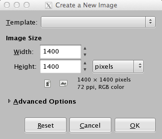
- Create new canvas with the appropriate dimensions. Create new canvas by going to File->New…
- Roll20 uses a grid size of 70px. The canvas should be a multiple of your grid size (i.e. a 700px by 700px grid will give you a grid of 10x10 squares. I’m using a 70px grid that will give me 20 squares by 20 squares
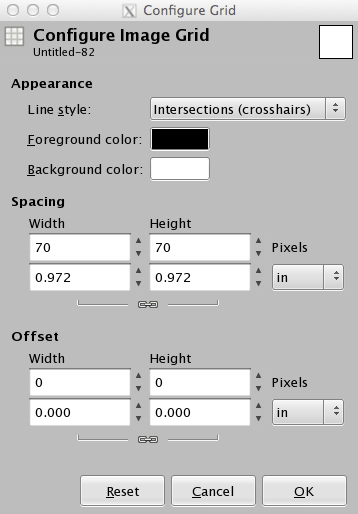
- Make sure the Grid is visible: View->Show Grid Chances are the Grid is not set to the dimensions you want, so to correct that, go to Image->Configure Grid…
- Make sure that Snap to Grid is enabled: View->Snap to Grid
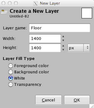
- We want to lay the cover for the floor, so we will add a new layer called “Floor.” To do this, In the Layers dock, click the new Layer button and in the New Layer dialog box, make sure it has the same dimensions as your canvas (it should, by default), and give it the name of Floor.
- Select the Floor layer in the Layers dock.
- Make sure that the patterns dialog open. It should be part of the Layers dock, at the bottom. If it’s not, open by: Windows->Dockable Dialogs->Patterns, or Shift+Ctrl+P
- Select->All to select the entire layer.
- On the Patterns dock, find a floor cover you want to use for you floor and select it.
- On the Toolbox window, select the Fill bucket. It will look like this:
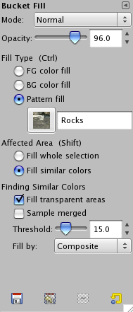
- When you select it, you should get a Bucket Fill dialog as part of the bottom section of the toolbox. Make sure Pattern Fill is selected. The dialog should also show you what pattern you have selected.
- Click inside the Floor layer and the pattern should fill the entire layer.
- Create a New Layer as before, but name this one Floor-color
- Click on the foreground color and change it to something obnoxious. This will enable beveling more easily.
- Click the Fill bucket in the Toolbox and make sure that FG color fill is selected
- Click the Floor-color layer and then click inside that layer’s image to fill with the color
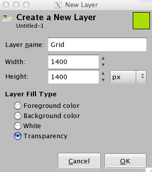
- Create a new layer called Grid; in the Layer Fill Type, make sure that Transparency is selected
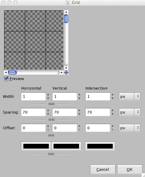
- With the Grid layer selected, click Filter->Render->Pattern->Grid…
- Set the width values to the line thickness you desire
- Set the Spacing to the size of your grid. For example, if your grid needs to be 70x70px, then set those values to 70, intersection can be left as 0
- Set the Offset value to 0.
- Make sure your color boxes at the bottom are the color that you want for your grid lines. I use black.
- Click Select->By Color
- Click the obnoxious color
- Your image should have a lot of dotted lines following the grid pattern.
- Click Select->Invert. This will make the grid lines as the select area.
- Click the eye next to the Floor-color layer. This will make the obnoxious color disappear, making things a little easier to work with.
- Select the Floor layer; the selection remains, but is now on the Floor layer.
- Click Filter->Decor->Add Bevel…
- You leave work on Copy select if you wish, but I unselect it, and click ok
- Your floor now has a beveled grid look to it.
- Add a new layer called Walls, make sure it’s the top layer.
- Hide (click the eye) all the layers except for Wall, Grid and Background (background should be white by default). This allows you to see what you are doing more easily as you create the walls of your map.
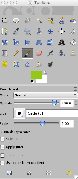
- On your toolbox, select the Paintbrush tool:
- Select a brush. I like Circle (11)
- The Foreground color isn’t as important, as we’ll be removing by filling it with a pattern once we are done. To make things easy, I just leave it as the same color that we used for the “Floor-color” layer.
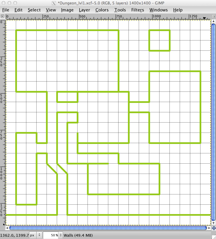
- With “Snap to Grid” enabled, you can now click once on a grid intersection point and a circle of color should appear. You can then use Shift+Left click to extend straight lines from the last click point. Be sure to take the “outside wall” all the way to the edge. This will be important when we go to fill in the space later.
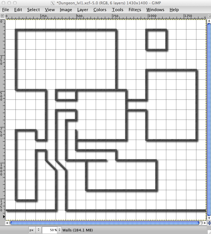
- Once your walls are laid out, you should have something that looks similar to this:
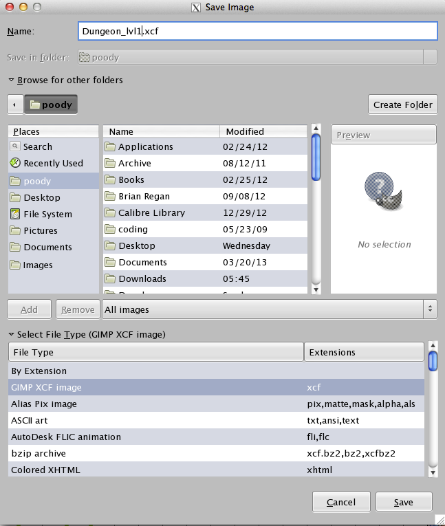
- Now would be a good time to save, if you haven’t already. File->Save As…
- Save the file as an
.xcf(gimp native format). We will export it later for use in other ways, but for now, this will preserve the layers. - Now, click Select->By color… and, with the Walls layer selected, click the wall line. All the wall lines should now be selected.
- Select the pattern you want to use for your walls. I like Slate.
- On your Toolbox, click the Fill Bucket and make sure the Pattern fill option is selected
- Click inside the selected area. The walls should now have that pattern instead of the color used to draw them.
- To make them look a little better, add a bevel (Filters->Decor->Add Bevel…
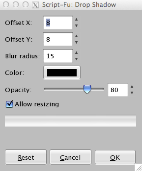
- To make the walls pop a little, click Filters->Light and Shadow->Drop Shadow… You’ll have a new layer called Drop Shadow. You’ll get a dialog box that looks like this:
- I just use the default values and click ok. Your image should now look something like this:
- If you want your fill area to be the same as wall, just make sure that the pattern has not changed. If it has, select the pattern you used for your walls. If you want something else for your fill, select that pattern now. I’m going to stick with Slate.
- Create a new layer called Solid.
- Select The Walls Layer
- Click the fuzzy select tool on the toolbox:
- Click in an area that should be solid. If you have some areas that are “disconnected” from the main body, you can use Shift+click to include those areas in your selection.
- Select the Solid Layer
- Select your Bucket Fill from the toolbox and make sure the Pattern fill is selected
- Click inside all the solid areas to fill with the pattern.
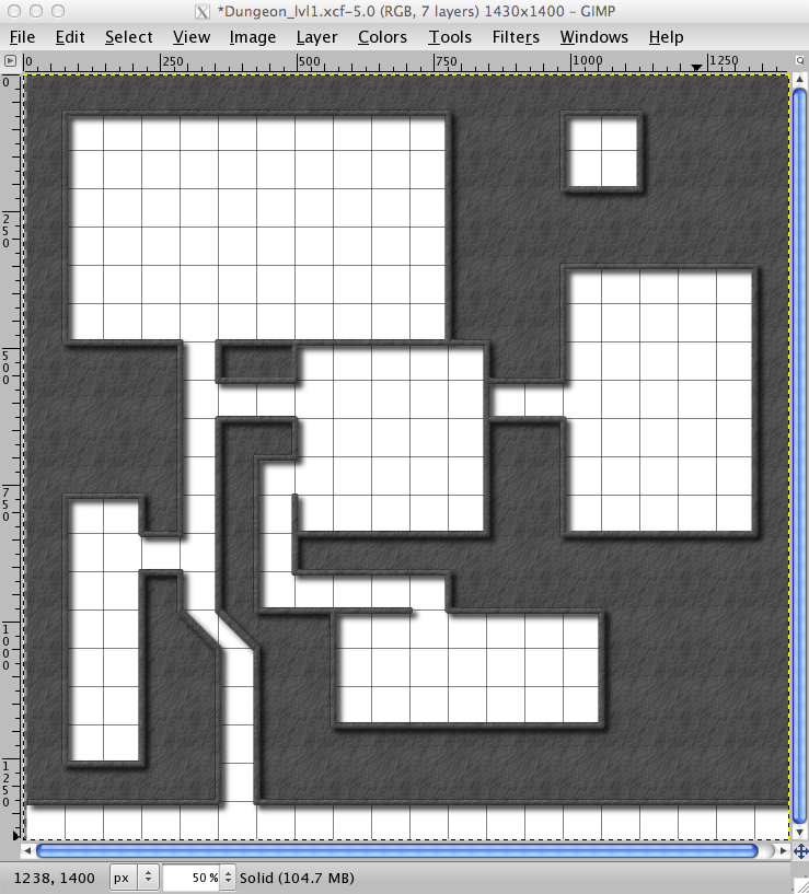
- Your image should look something like this:
- Because I like my “outside” the dungeon to have a different floor than the dungeon, we can use the Rectangle Select Tool:
- In my image, I’m going to select a square that encompasses the bottom row of squares only.
- Then I’ll select the Dried Mud pattern.
- Select the Fill Bucket tool and make sure that the Pattern fill option is selected
- Then click inside the selected area.
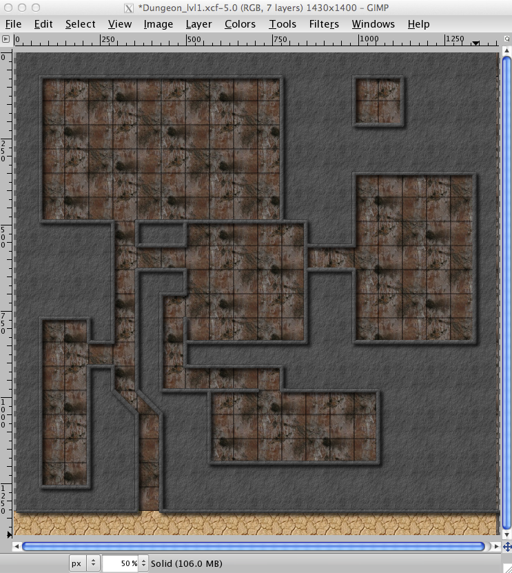
- Unhide your Floor Layer and you can see how things are coming together. My dungeon looks like this:
- Save.
- Clean up, before we put the finishing touches on the map. Hide all the layers, except for Walls and Drop Shadow.
- Now, click on Layer->Merge Down. This will combine those two layers together., So, now you shouldn’t have a Drop Shadows layer, but just a Walls layer that has the Drop Shadows on it, too.
- Now to add doors to our rooms… Unhide the Background and the Grid Layers and leave Walls visible, too.
- Create a new layer called Doors. I like to keep the layers separate, in case I mess something up, I don’t mess up everything else I’ve done. Make sure the Doors layer is selected.
- Select a pattern you think will be good for doors.
- Select the Paintbrush tool and select a brush you want to use for the doors. I like Circle (07). It’s slightly smaller than the walls.
- Using the same technique you used for the walls, place the doors on the map where they belong. You should still be using the same foreground color that was used to paint the walls before we applied the pattern.
- Once your doors are on, Select->By Color and select one of the “doors.”
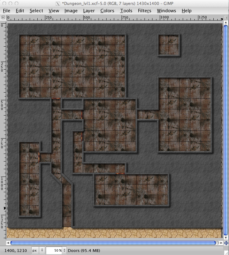
- We are now going to use the same steps we used for the walls (steps 41-47): Bucket fill with Pattern fill selected, Fill in the doors, Filter->Decor->Add Bevel…, Filter->Light and Shadow->Drop Shadow…
- Hide all the layers except for Drop Shadow and Doors
- Select the Drop Shadow layer (should be the top layer) and Layer->Merge Down. You should now only have one layer for Doors and no layer for Drop Shadow.
- Unhide Walls, Solid, Grid (if you wish), Floor and Background. Your map should look something like this:
- I like the Doors layer to be right below the Walls layer, so the doors don’t overlap above the walls.
- Save.
- You can now populate your map with whatever furniture, monster, etc. you desire. (See the Tips and Tricks for some URLs where you can get some of these things). My recommendation is to do this population on a separate layer.
- File->Save a Copy… Under Select File Type select the type of file you will want to use for Roll20, I like PNG files. When prompted, select Merge Visible Layers and then click Export, and when prompted, click Save (I typically don’t change any of the defaults on the pop-up window).
- You are now ready to use your map
[edit] See Also
- Free Art Assets - list of free art assets useful for map-making
- Useful links for mapping - other alternative to create maps for Roll20


