Image use in character sheets
From Roll20 Wiki
Main Article: Building Character Sheets
This is a guide on how to display images on your custom character sheets. For more info, see the main article.
You can have static images on your character sheet, such as placing the logo for the game at the top, or having an image in the background to make the sheet look nicer overall. To show an image on a character sheet, you need to refer to the exact URL of where it's located on the internet.
If you're creating a character sheet that will be added to Roll20 for everybody's use, it's highly recommended to upload the images to GitHub along with the sheet code, so the image is secure and don't risk disappearing like is possible with free image hosting sources or directly linking to some website.
Contents |
Logo
Example:
<img src="https://raw.githubusercontent.com/Roll20/roll20-character-sheets/master/kitchensink/logo.png" />
img {
  max-height: 100px;
}
In Roll20's character sheet template, the image source is directly linked to the version existing in Roll20's GitHub, and works because the image exist in that exact place. The images size is defined in the .css-file to be max 100px hight, otherwise it would have retained it's original size.
Background
Example 1: Pattern
.charsheet {
  background-image: url(https://cdn.pixabay.com/photo/2015/09/29/15/12/stars-964022_960_720.png); /*black space with tiny white stars*/
  background-color: black;
  background-repeat: repeat;
  color: white;
}
The Star Wars D6-character sheet displays in the background an black image with tiny white stars.
Defining the background image in .charsheet results in it showing for the whole character sheet without having to create a separate html-element like a <div>.
By defining background-repeat: repeat;, the imgae repeats as an pattern in the background if it doesn't cover the entire character sheet. The background-color: black; is an backup in case the image stops working, keeping the sheet background almost identical without causing readability issues. color: white; sets the default text color of the sheet as white, which is much more readable against the black background.
Example 2: Border
The following example is using an background image to recreate the stylized border used in the pdf-version of the sheet. Feast of Legends-character sheet by Anduh "Feast of Legends" preview image
div.sheet-main {
  display: grid;
  grid-template-columns: 3.5fr 3.5fr;
  grid-template-rows: 2fr 0.6fr 2.3fr 0.7fr 3fr 0.7fr 1fr 2fr;
  grid-template-areas:"logo       name"
                      "logo       bio"
                      "stats      bio"
                      "stats      gold"
                      "stats      load"
                      "stats      skilled"
                      "resistance order-skills"
                      "resistance order-skills";
  grid-gap: 6px;
  width:    650px; /* Defines the width and height of the sheet */
  height:   900px;
  background-image: url(https://github.com/Roll20/roll20-character-sheets/blob/master/Feast_of_Legends/images/FoLborder.jpg?raw=true);
  background-size: 650px 900px; /* Sets the sheet border image to same size as sheet */
  background-repeat: no-repeat;
}
<div class="main">

/* the full sheet's code inside this <div> element */

</div>
The last 5 rows of div.sheet-main are the relevant parts for the example. It defines the sheet's dimensions to (650px * 900px), and does the same for the background image. This ensuring that if the character sheet-window is resizing in Roll20 by the user, the image and the sheet itself don't stretch or get misaligned.
Roll Button
Instead of using text, or the custom dice font for designing your roll buttons, you can use an image.
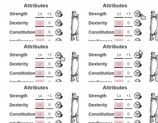
The following example is taken from the Ambition & Avarice-sheet by Anduh, which changes a few roll buttons to use a stylized image of the dice, rather than the image font.
button[type="roll"].sheet-d20:before{
  content: ' ';
}

button[type="roll"].sheet-d20:hover{
  background-position: 0;
}

button[type="roll"].sheet-d20{
  background-image: url(https://raw.githubusercontent.com/Roll20/roll20-character-sheets/master/Ambition_Avarice/images/d20.png);
  background-size: 26px 26px;
  background-repeat: no-repeat;
  width: 26px;
  height: 26px;
  border-style: none;
  background-color: transparent;
  margin-left: 5px;
}
<button name="roll_str" type="roll" value="&{template:default} {{name= **Strength** (Test)}} {{Roll=[[1d20+(@{str_mod})]]}}" class="d20"></button>
The button[type="roll"].sheet-d20:before-block removes the default d20 image from the roll button. The button[type="roll"].sheet-d20:hover removes a kind of "wobble" the image would otherwise get.
In button[type="roll"].sheet-d20, the image source is defined, and is set to have exact the same dimensions as the button itself. The usual border of buttons as well as the default gray color is removed as well to make the button blend in better.
See Also
- CSS Wizardry - tips in styling character sheets
- Designing Character Sheet Layout - tips on how to best design the broad strokes of a character sheet
- Sheet Design Best Practices
- List of all pages related to "Character Sheet Creation"
- Roll20 GitHub repository


