Page Settings
From Roll20 Wiki
There are a number of page specific settings that can be set for each page on your map. To access them, click the page button located on the top right hand corner of your map. To edit the settings for a specific page, click the gear icon next to the page you'd like to edit.
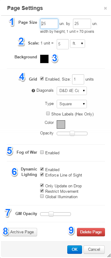
You will be presented with the Page Settings dialogue.
1. Page Size The size of the page canvass can be adjusted here, by changing the width and height values. Page size is measured in inches, with the scale of one inch = five feet, so if you require a map that is fifty feet squared, you would adjust your page size to be ten inches by ten inches.
2. Scale Scale will allow you to chose the unit of measurement for a single square. Chose between ft, m, km and mi and select how many of that unit each square is worth.
3. Background Using the Background Color palette, you can select a fill color for the entire map. Click on the color swatch (white box by default) which will pull up the color chooser. From there, you can either select the color you'd like from the palette, or, for advanced users, enter a specific hexadecimal color code. (For a list of colors, try Colorpicker.com.
4. Grid There are a number of different grid options to choose from, including size of the grid, how diagonal distance is measured (D&D 4e, 3.5/Pathfinder, Euclidean or Manhattan), type of grid (square, horizontal hex and vertical hex), whether or not to display labels on the border (hex grids only) and the color and opacity of the grid.
To enable or disable the grid, simply select the Enabled checkbox. If it's checked, the grid is on, unchecked and the grid is completely off.
Note: disabling the grid will also disable any grid snapping effects, since there's nothing for the objects to snap to.
The grid can also be made smaller or larger by adjusting the size. For example, if I entered 0.5 inches into the size box, it would make the grid half the size that it is by default. Likewise, a size of 2 inches would double the grid size.
Just like the background color, you can also select what color you'd like your grid lines to be. By clicking on the color selection box, you'll be presented with a palette where you can either select a color, or enter a custom hex code.
If you'd like to make your grid lines darker or lighter, you can adjust the opacity using the grid opacity slider. This slider will make the grid more, or less transparent, so you can make it fade into the background, or boldly stand out. Simply slide it to the left to make the lines more transparent, or to the right to make them more opaque. If you slide the bar all the way to the right, your lines will become invisible. This is handy if you still want the snap to grid feature, but don't want to see the lines.
5. Fog of War If you'd like to use the Fog of War feature, you must first enable it for the page. To do so, select the "Enabled" checkbox. This will turn it on for the page, and cover the entire map in fog.
For more information on using Fog of War, including how to reveal areas, consult the Fog of War help guide.
6. Dynamic Lighting If you 'd like to use the Fog of war feature, you must first enable it for the page. To do so, select the "Enabled" checkbox. You can use Fog of War In combination with Dynamic Lighting, but one is not dependant on the other to function.
If you or your players suffer from sluggish dynamic lighting render results you might want to consider checking the option Only Update on Drop. This option only redraws the dynamic lighting after a token has been picked up and placed elsewhere on the map. This can lessen the render burden for users running on slower connection speeds or when a GM is working with a very large or complex map.
For more information on using Dynamic Lighting, consult the Dynamic Lighting help guide.
7. GM Opacity The fog appears as a solid black area to players, but for the GM it's a semi-transparent layer. If you'd like to adjust how dark the fog appears to you (handy for dark maps where it's hard to tell where it is) use the "GM Opacity" slider to adjust how transparent or opaque it appears. Simply slide the slider to the left to make the fog lighter, or to the right to make it darker. If the slider is all the way to the left, the fog will be completely invisible, and if it's all the way right, it will be completely solid.
8. Archive Page You can archive any page to save for use in the future, either in your current campaign or use the Transmogrifier to move your favorite pages to use in a new campaign.


