Difference between revisions of "Designing Character Sheet Layout"
From Roll20 Wiki
Andreas J. (Talk | contribs) m (Multiple-column layout) |
Andreas J. (Talk | contribs) m (→CSS Grid) |
||
| (3 intermediate revisions by one user not shown) | |||
| Line 1: | Line 1: | ||
| − | {{revdate}}{{ | + | {{revdate}}{{BCS|page}} |
| − | + | ||
This is a general guide to different approaches/methods people use for designing layouts on Roll20 character sheets. | This is a general guide to different approaches/methods people use for designing layouts on Roll20 character sheets. | ||
| Line 6: | Line 5: | ||
{{notebox|These examples should work for both [[Character Sheet Enhancement]] and [[Legacy Sheet]] frameworks.}} | {{notebox|These examples should work for both [[Character Sheet Enhancement]] and [[Legacy Sheet]] frameworks.}} | ||
| − | = Layout | + | = Layout Methods = |
Here are some of the popular approaches/frameworks that people use for designing HTML/CSS layouts, with examples on Roll20 character sheets. | Here are some of the popular approaches/frameworks that people use for designing HTML/CSS layouts, with examples on Roll20 character sheets. | ||
| Line 19: | Line 18: | ||
* [https://developer.mozilla.org/en-US/docs/Web/CSS/CSS_Grid_Layout CSS Grid Layout] MDN Web docs | * [https://developer.mozilla.org/en-US/docs/Web/CSS/CSS_Grid_Layout CSS Grid Layout] MDN Web docs | ||
* {{fpl|9973786/ sheet example on converting from table to CSS Grid}} | * {{fpl|9973786/ sheet example on converting from table to CSS Grid}} | ||
| + | * https://cybersphere.me/dont-use-table-use-grid/ blogpost by [[GiGs]] | ||
{{ex}} | {{ex}} | ||
| Line 240: | Line 240: | ||
| − | + | =Sheet Components= | |
[[File:Sheet-with-pages-example.gif|right|thumbnail|400px|sheet with multiple pages/tabs]] | [[File:Sheet-with-pages-example.gif|right|thumbnail|400px|sheet with multiple pages/tabs]] | ||
| − | =Pages = | + | ==Pages == |
''Example:'' '''[[CSS_Wizardry#Tabs|Tabs]]''' | ''Example:'' '''[[CSS_Wizardry#Tabs|Tabs]]''' | ||
| Line 251: | Line 251: | ||
<br> | <br> | ||
| − | =Images= | + | ==Images== |
| − | + | {{main|Image use in character sheets}} | |
You'll likely want to use images to improve the looks of a sheet, and there are a few example of how to do so, like displaying a logo or having a nice background. | You'll likely want to use images to improve the looks of a sheet, and there are a few example of how to do so, like displaying a logo or having a nice background. | ||
| + | |||
| + | This might even include showing the characters [[Image_use_in_character_sheets#Avatar_.26_Token|Avatar or Token]] on the sheet. | ||
| + | |||
| + | ==[[BCS/Repeating_Sections#Styling_Repeating_Sections|Repeating Sections]]== | ||
| + | |||
| + | If you use [[BCS/Rep|repeating sections]] on your sheet, styling and planing how your design them can have a large impact on sheet layout, requiring a flexible design if users want lots of entries. | ||
| + | |||
| + | |||
= Sheet Templates = | = Sheet Templates = | ||
| Line 272: | Line 280: | ||
** [[Creating Roll Templates]] - How to design Roll templates, and info on how the default rolltemplate works | ** [[Creating Roll Templates]] - How to design Roll templates, and info on how the default rolltemplate works | ||
** [[Building_Character_Sheets#Best_Practices | Sheet Design Best Practices]] | ** [[Building_Character_Sheets#Best_Practices | Sheet Design Best Practices]] | ||
| − | ** '''[[:Category:Character Sheet Creation | + | ** '''[[:Category:Character Sheet Creation]]''' |
* [[Sheet Author Tips]] More advanced tips for creating/maintaining sheets, workflow, & useful tools | * [[Sheet Author Tips]] More advanced tips for creating/maintaining sheets, workflow, & useful tools | ||
** [[Custom Sheet Sandbox|Sheet Sandbox]] – the better editor to use when you code your character sheets | ** [[Custom Sheet Sandbox|Sheet Sandbox]] – the better editor to use when you code your character sheets | ||
Latest revision as of 05:30, 5 April 2022
Page Updated: 2022-04-05 |
| This page is related to Editing(coding) Character Sheets, which require Pro info to be able to use.Main Page: Building Character Sheets |
This is a general guide to different approaches/methods people use for designing layouts on Roll20 character sheets.
Character Sheet Development
Getting Started
- Using Custom Sheets
- Building Sheets
(Main Page) - Glossary
- Code Restrictions
- Best Practice
- Common Mistakes
- Tutorials
- Examples, Templates
- Pattern Libraries
- HTML & storing data
- CSS & Styling
- Sheet Layout
- Images Use
- Fonts & Icons
- Dark Mode
- Mobile
General
- Updates & Changelog
- Known Bugs
- Character Sheet Enhancement(CSE)
- Custom Roll Parsing
- Legacy Sheet(LCS)
- Beacon SDK
Reference
- Buttons
- Repeating Sections
- Sheetworkers
- Roll Templates
- sheet.json
- Translation
- Auto-Calc
- Advanced
- All SheetDev Pages
Tools & Tips
Other
| These examples should work for both Character Sheet Enhancement and Legacy Sheet frameworks. |
Contents |
[edit] Layout Methods
Here are some of the popular approaches/frameworks that people use for designing HTML/CSS layouts, with examples on Roll20 character sheets.
See #Sheet Templates for more comprehensive examples of sheets using these methods.
Check CSS Layout cookbook
[edit] CSS Grid
Many newer character sheet use CSS Grid for their layout, and is the recommended method doing the general layout of sections on a sheet. Aligning things in a grid, by using rows & columns is great, and you can have elements overlap and even span several "spots" on the grid. Many tend to use flexbox for styling inside individual sections/blocks on the sheet, if grid seems overkill.
- A Complete Guide to CSS Grid
- CSS Grid Garden is a great training game for learning about CSS Grid.
- CSS Grid Layout MDN Web docs
- sheet example on converting from table to CSS Grid(Forum)
- https://cybersphere.me/dont-use-table-use-grid/ blogpost by GiGs
Example:
<div class="sheet-grid-section">
  <span>1st span</span>
  <span>2nd</span>
  <span>3rd</span>
  <span>4th, stuff</span>
  <span>5th, other</span>
  <span>6th</span>
</div>
.charsheet .sheet-grid-section{
  display: grid;
  grid-template-columns: 600px 300px;
  grid-template-rows: 150px 150px 150px;
}
[edit] grid-template-areas
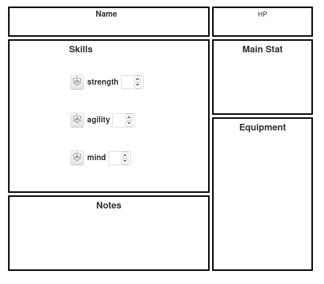
grid-template-areas can be used for naming sheet sections and then easily display in a human-readable way how each section is positioned in the grid. The drawback is that you can't have sections that overlap with each-other using this.
<div class="sheet-grid-section">
  <div class="sheet-namelvl sheet-block">
    <label>Name</label>
  </div>
  <div class="sheet-hp sheet-block">
    <span>HP</span>
  </div>
  <div class="sheet-stat sheet-block">
    <h3>Main Stat</h3>
  </div>
  <div class="sheet-skills sheet-block">
    <h3>Skills</h3>
    <label><button name="roll_str" value="/r 1d6+@{str}" type="roll"></button> strength <input type="number" name="attr_str"></label>
    <label><button name="roll_agi" value="/r 1d6+@{agi}" type="roll"></button> agility <input type="number" name="attr_agi"></label>
    <label><button name="roll_mind" value="/r 1d6+@{mind}" type="roll"></button> mind <input type="number" name="attr_mind"></label>
  </div>
  <div class="sheet-equip sheet-block">
    <h3>Equipment</h3>
  </div>
  <div class="sheet-notes sheet-block">
    <h3>Notes</h3>
  </div>
</div>
.charsheet .sheet-grid-section{
  display: grid;
  grid-template-columns: 400px 200px;
  grid-template-rows:  60px 150px 150px 150px;
  grid-template-areas:"namelvl hp     "
                      "skills  stat   "
                      "skills  equip  "
                      "notes   equip  ";
  grid-gap: 5px;
}
.charsheet div.sheet-block{
  display: grid;
  justify-content: center;
  padding: 5px;
  border: 3px solid black;
}
.charsheet div.sheet-namelvl{
  grid-area: namelvl;
}
.charsheet div.sheet-hp{
  grid-area: hp;
}
.charsheet div.sheet-stat{
  grid-area: stat;
}
.charsheet div.sheet-skills{
  grid-area: skills;
}
.charsheet div.sheet-equip{
  grid-area: equip;
}
.charsheet div.sheet-notes{
  grid-area: notes;
}
[edit] Subgrid
Subgrid is only available for Firefox, but when it's released for Chrome sheet design will get more easy as you can use the main grid lines in children, making it easier to align sub-components with main components of the sheet.
You can implement subgrid in sheets, and then create a fallback design, in case the browser doesn't support CSS Subgrid.
<div class="sheet-grid">
  <div class="sheet-item">
    <div class="sheet-subitem"></div>
  </div>
</div>
.charsheet .sheet-grid {
  display: grid;
  grid-template-columns: repeat(9, 1fr);
  grid-template-rows: repeat(4, minmax(100px, auto));
}

.charsheet .sheet-item {
  display: grid;
  grid-column: 2 / 7;
  grid-row: 2 / 4;
  grid-template-columns: subgrid;
  grid-template-rows: repeat(3, 80px);
}

.charsheet .sheet-subitem {
  grid-column: 3 / 6;
  grid-row: 1 / 3;
}
[edit] CSS Flexbox
Flexbox is a good way to align elements in rows or columns that flex and wraps around to new rows depending on the elements. Better than using the old float: right; method of aligning things. Some sheet authors use CSS Grid for bigger elements and gid-like sections of a sheet, while using Flexbox for smaller components in the sheet.
Flexbox Froggy is a great training game for learning about Flexbox.
<div class="sheet-flex-section">
  <span>1st</span>
  <span>2nd</span>
  <span>3rd</span>
  <span>4th</span>
  <span>5th</span>
  <span>6th</span>
</div>
.charsheet .sheet-flex-section{
  display: flex;
  flex-direction: column;
  flex-wrap: wrap;
  align-items: center;
}
[edit] Multiple-column layout
See more at: Multiple-column layout
<div class="sheet-container">
  <span>1st</span>
  <span>2nd</span>
  <span>3rd</span>
</div>
.charsheet .sheet-container {
  column-count: 3;
}
[edit] Roll20 columns/rows
Okay for basic layouts, but if you aim for a more complex/sophisticated layout/design, CSS Grid and/or CSS Flexbox is recommended.
Roll20 provides a few basic classes you can use to organize things into a simple column-based layout. To use them, just create a div with classnames such as sheet-3colrow, sheet-2colrow, or sheet-row. Then inside of that div, create a div for each column with a class of sheet-col. For example, to create a 3-column layout:
<div class="sheet-3colrow">
  <div class="sheet-col">
    <h2>Skills</h2>
    <label>str</label>
    <input type="number" name="attr_str">
    <label>agi</label>
    <input type="number" name="attr_agi">
    <label>mind</label>
    <input type="number" name="attr_mind">
  </div>

  <div class="sheet-col">
    <h2>Main Stats</h2>
    <label>hp</label>
    <input type="number" name="attr_hp">
    <label>defence</label>
    <input type="number" name="attr_defence">
  </div>

  <div class="sheet-col">
    <h2>Equipment</h2>
    <textarea name="attr_equip"></textarea>
  </div>
</div>
You can then further style & adjust then in the CSS:
.charsheet .sheet-col{
  background: grey;
}
The it's not clear what the css for these are, so styling gets harder the more changes you try to make on how they look. It's better to switch to use Flexbox/CSS Grid eventually.
You can use browser tools to inspect and figure out how the css for these columns & rows work.
[edit] HTML Table
Using <table> is the fourth, and least recommended method, for designing basic sheet layout.
Many older sheet use HTML tables for layout, but it's harder to customize and adjust to looks of it compared to other methods, so it's generally not seen as a good idea for sheet layout.
- HTML table guide
- Tables - MDN Web docs
- Article: Why you shouldn't use HTML tables for layout
Roll20 don't accept new sheet submissions that rely on HTML tables for design(Minimum Requirements -Sheet Code), so you shouldn't be using <table> if you want your sheet published in the dropdown. |
Older sheets using tables do exist in the Roll20 character sheet repository, but they where created before the rule was set in place. These older sheets shouldn't be used as templates for your own designs, instead pick more recently created sheets, or some suggested here.
[edit] Sheet Components
[edit] Pages
Example: Tabs
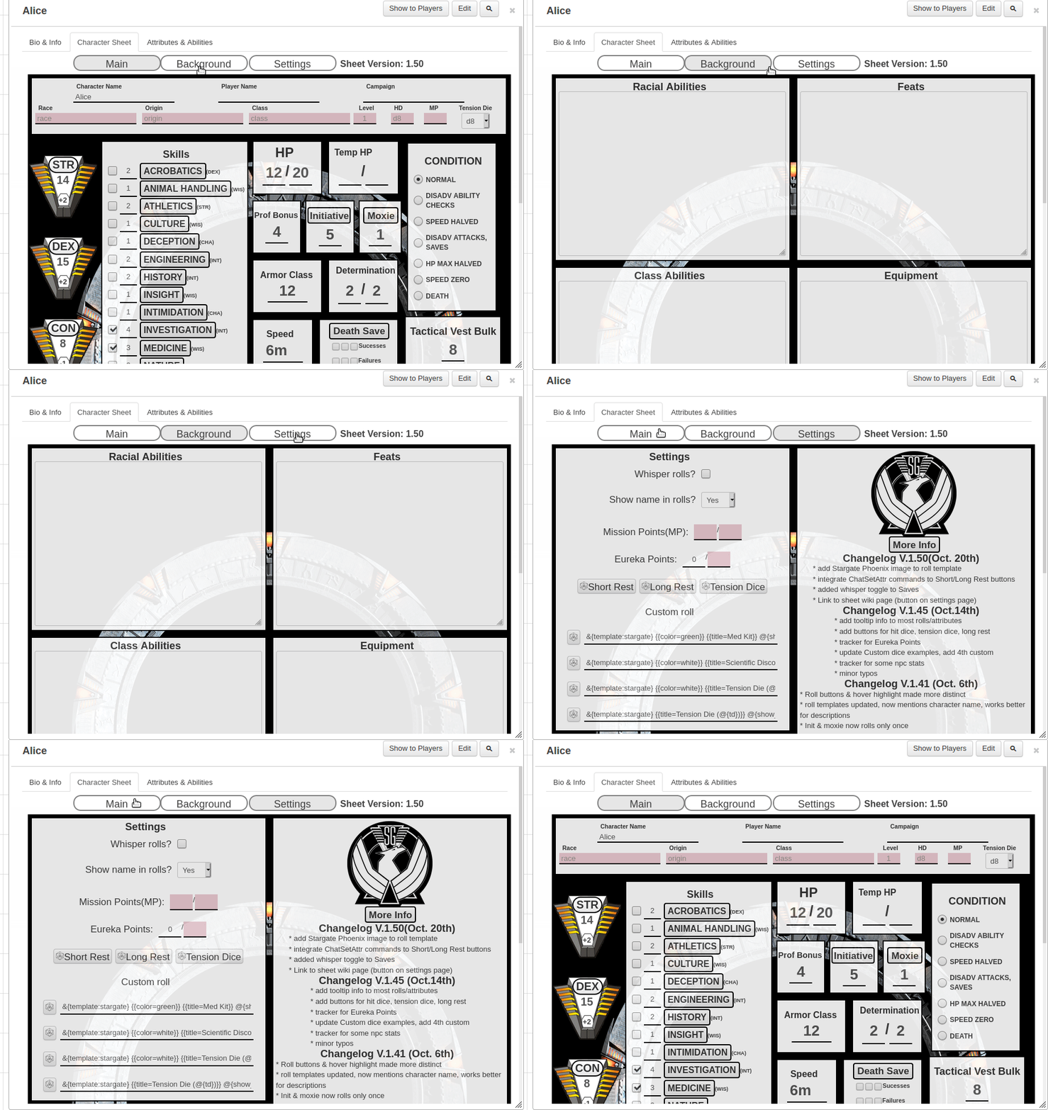
When trying to mimic the paper-version of the sheet, or the sheet starts to become too long, it's a good idea to split up content into separate tabs/pages, see Tabs.
The section above also show how you can hide areas with checkboxes, useful for temporally hiding/expanding some section for displaying more info.
[edit] Images
Main Page: Image use in character sheets
You'll likely want to use images to improve the looks of a sheet, and there are a few example of how to do so, like displaying a logo or having a nice background.
This might even include showing the characters Avatar or Token on the sheet.
[edit] Repeating Sections
If you use repeating sections on your sheet, styling and planing how your design them can have a large impact on sheet layout, requiring a flexible design if users want lots of entries.
[edit] Sheet Templates
There exist a couple of character sheet templates that are intended as a starting point for character sheet creations.
- Complete Sheet Examples - list of current sheets that can be good examples in general
- Roll20's "kitchensink" - Roll20's template, uses the built-in Roll20 columns/rows for layout (fairly old and dated example, but functional)
- CSS Grid sheet template - simple sheet layout using CSS Grid, by Andreas J.
- Cassie's sheet template - sheet skeleton that uses PUG & SCSS, not recommended for beginners - by Cassie
- Blades-template - by Jakob - based on Blades in the Dark-sheet
- Aureyia's Roll20 Sheet Boilerplate - Uses PUGjs, Stylus(CSS) & Gulp
[edit] See Also
- Building Character Sheets – main article
- CSS Wizardry - List of Tips & Tricks on how to create a variety of effects on your character sheet
- Image use in character sheets - How to include images on your character sheets
- Creating Roll Templates - How to design Roll templates, and info on how the default rolltemplate works
- Sheet Design Best Practices
- Category:Character Sheet Creation
- Sheet Author Tips More advanced tips for creating/maintaining sheets, workflow, & useful tools
- Sheet Sandbox – the better editor to use when you code your character sheets
- Roll20 GitHub repository


